Blue Crab Moving
Blue Crab Moving is a family-owned moving company out of Maryland. They launched in April 2026 with a logo in hand and two strong colors to put on the site — blue and red, no secondary. Our job: build a site that converts and, more importantly, a site people will let into their home.
Client and colors
General branding rule: one identity has one primary color and one secondary. One carries attention, the other supports. In most cases two strong colors at once don't work — one kills the other and everything visually fights for the same space.
But because we've been trained for generations on flags, on the contrast of hot and cold, red and blue here fit without conflict. Flags are pre-trained context — the brain reads them as one whole, not as two elements fighting each other.
Blue Crab Moving launched in April 2026. They brought the logo with them, and with it both colors already set as primary, no secondary. Our job was to assign them roles on the site.
We gave red to the buttons. Visually it's stronger and pulls a click better. Blue carries everything else: header, titles, accents. No gray or any "neutral" help — in practice this is how companies that started from the business, not from identity, get through.
Our approach
Every site we build is structured around two things:
- ✓Conversion. The customer can take the next action at any moment, so money can move from their hand into theirs.
- ✓Time on site. The longer someone stays, the higher the chance they cross into action.
Every other decision is measured against these two metrics. If some "pretty" thing reduces conversion, it gets cut. If it extends time on site without hurting conversion, it stays.
Trust first
We've moved house ourselves, multiple times. We know how the industry works: customers choose who they'll let into their home. Number one is trust, everything else comes after.
Blue Crab had just started. No Google reviews, no Yelp profile, no "X years of experience" story. There was no reputation to borrow, so we had to build it visually on the site.
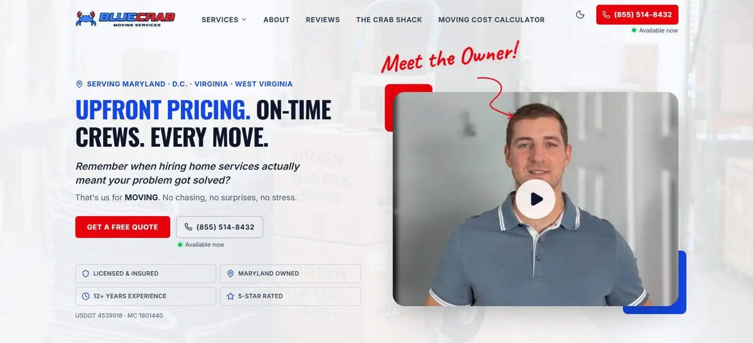
Owner on camera
The first thing the visitor sees is the person behind the company. The owner stepped in front of the camera even though he has no experience with filming. The goal wasn't a polished commercial; the goal was to see a normal, honest, hard-working man.
We deliberately didn't polish it. A bit amateurish, a bit unrehearsed, real. Because that kind of video reads as true, and a polished spot reads like you're hiding something.
Copy that triggers emotion
Almost everyone has hired at least one company for work around the house and regretted it. A plumber who didn't show up at the agreed time, a handyman who "fixed" it and then it leaked two days later. That emotion is shared and easy to activate.
The copy on the site leans on a question everyone understands: do you remember when hiring a company meant the problem was solved? That isn't marketing language. That's what everyone, in the back of their head, thinks when they need to hire someone: what's going to happen this time.
American signal without patriotic noise
The site subtly echoes the American flag. Blue, red, white stars. Not openly, not with a flag draped over you — just enough to activate the feeling of patriotism as a background emotion, without it becoming overwhelming or overdone.
The background visuals are local too: Capitol Hill, the obelisk. Small details that tie the site to the Washington DC region without naming it explicitly.
Video testimonials that rotate
Right below the hero sit video testimonials. Real people, real voices. Recording a video testimonial is hard; most clients won't, but Blue Crab managed to collect a few and that separates them from competition that is still on text-only reviews.
Technical detail few mention: we track how many clicks and how many seconds of viewing each video gets. Over time we drop the ones not getting attention and add new ones. The section always holds only the strongest material; old videos do not stay "for the count".
Price on home, calculator without a form
The industry hides price. Classic: "call for a free estimate". The customer calls five companies, gets five different answers, no one is sure what's realistic.
We put the starting price right on the home page. Not a secret, not a quote — a clear number under the headline. Behind it sits a Moving Cost Calculator: the customer enters parameters and gets a price estimate without email and without a phone number. Only at the end of the calculation, when they already have a number, do we walk them to a form for the most accurate estimate, which then asks for contact.
Reason: when a visitor sees a price before they're "obligated", trust goes up. The industry does not do this, which means this move directly separates Blue Crab from other sites in the same search.
Page flow
Sections follow the order of the questions the customer is already asking themselves:
- ✓Hero with price, person, and a video testimonial.
- ✓What happens if you take someone else to move (contrast).
- ✓What happens if you take Blue Crab.
- ✓Why exactly them.
- ✓How to hire them in three steps.
- ✓Only then: the form.
The form is last, not first. The visitor arrives at it already convinced, not as someone who needs to be lured.
Details we don't announce
A site people love is not a site that shouts. There are the small touches only those who stay long enough notice:
- ✓A crab in the navigation walks up to the letter B in the logo every few minutes, erases it, returns. Only those who scroll with intent see it.
- ✓A small crab in the footer walks left and right every thirty seconds or so. No one is looking for it, no one misses it.
- ✓Weekdays from 8 to 18, a green dot next to the phone number pulses and says Available now. During those hours people call more often than they fill the form.
This is not a gimmick. These are the small touches that the people who notice them end up loving the site for.
Mobile version: call before form
On mobile, two buttons sit pinned to the bottom at all times: call and form. The call button is deliberately bigger. In the moving industry, a phone call always converts better than a form, especially if the customer is already scrolling with the thought "I need someone, now".
The form stays available for those who can't talk in that moment, but it's given lower visual priority. A small detail that bends the conversion curve on phone.
How fast is the Blue Crab Moving site?
The Blue Crab Moving site scored 100/100 across all four PageSpeed categories (Performance, Accessibility, Best Practices, SEO), measured via Google PageSpeed Insights in April 2026.
The site isn't just "fast enough". The site is in the green zone on every technical metric Google uses for ranking.
On GTmetrix the grade is A, performance 97%, structure 98%. Web Vitals:
And we scan the site regularly with Screaming Frog. The site is clean as a whistle: no broken links, no duplicates, no empty meta descriptions, no pages cut off from the structure.
Speed is not decoration. Speed is a cheaper form of SEO than links, and in local competition it is often decisive. A site that loads in a second beats a site that loads in three.
- GTmetrix · speed, structure, Web Vitals
- PageSpeed Insights · Google's performance, accessibility, SEO scores
- Screaming Frog · complete technical site audit (free up to 500 URLs)
SEO: transactional keywords and 72 cities
We started the research from a question: what words does a customer type when they already know they need a move? Not when they're researching, not when they're thinking — when they've already decided and they're picking who to hire.
Those words are transactional, not informational. The typical form is movers in {city}: the customer isn't looking for an article, they're looking for a company.
The site is built around two axes: service × location. Every service Blue Crab performs gets a page; every city in their county gets its own. The county has about 72 cities — pages are built for all of them.
Estimate: in about six months a new company without directories can be on the first page of Google for key local keywords, including AI overviews that rank by the same logic.
How many clicks did the site get in month one?
The Blue Crab Moving site received 80 organic clicks from Google search in the first 30 days after launch, with zero directories, reviews, or backlinks. Data from Google Search Console, May 2026.
The site went live with no external signal of any kind. This is the state after thirty days:
No Google My Business profile. No Yelp. No TrustPilot reviews. Not a single backlink we hadn't placed ourselves. Just the site and transactional targeting.
The searches that found us were like Movers Bethesda, Silver Spring movers, long distance movers Maryland. People who aren't there to be educated or kill time, but to hire a company today.
What's next
The next months go to: directories, reviews, new city pages, additional local signals. Each of these elements pushes the ranking further on searches where we already hold a position.
The site is just starting. 80 clicks in month one with no support of any kind is only a starting point. With every new review, with every new city page, the curve goes up.
The competition arrived to the race on a bus
Moving is an industry that has existed since the start of the web. It's logical to think it's all taken, that there's no room for a new company on the first page of Google, and that it makes no sense to even try.
Open Google. In the nav bar of someone's site it says "Movers near me", and below sits a listed line of cities with no structure. Half the links go nowhere. That's the current state of the competition.
So when someone from the industry asks us whether a new site even makes sense, our answer isn't "we'll see". Our answer is: in six months from launch, if the site doesn't bring you 1000 organic visits per month from SEO alone, we give you the money back. That's how sure we are of the position you get from the basics.
The reason is simple. The industry chases trends. Thousands of "how to" pages get built where the visitor spends ten minutes reading and leaves without buying anything. Google reads that kind of site as a help center, not as a moving company, and ranks it as a help center. Most are so busy with advanced tricks that they've forgotten the basics: speed, structure, transactional keywords, clean schema, local city pages. Plain old SEO still works the same as it did ten years ago and will keep working that way. People do advanced things before they've covered the basics.
If you run the competition through GTmetrix, PageSpeed Insights and Screaming Frog, you see what we see: they arrived to the race on a bus. We have the formula.